

towa
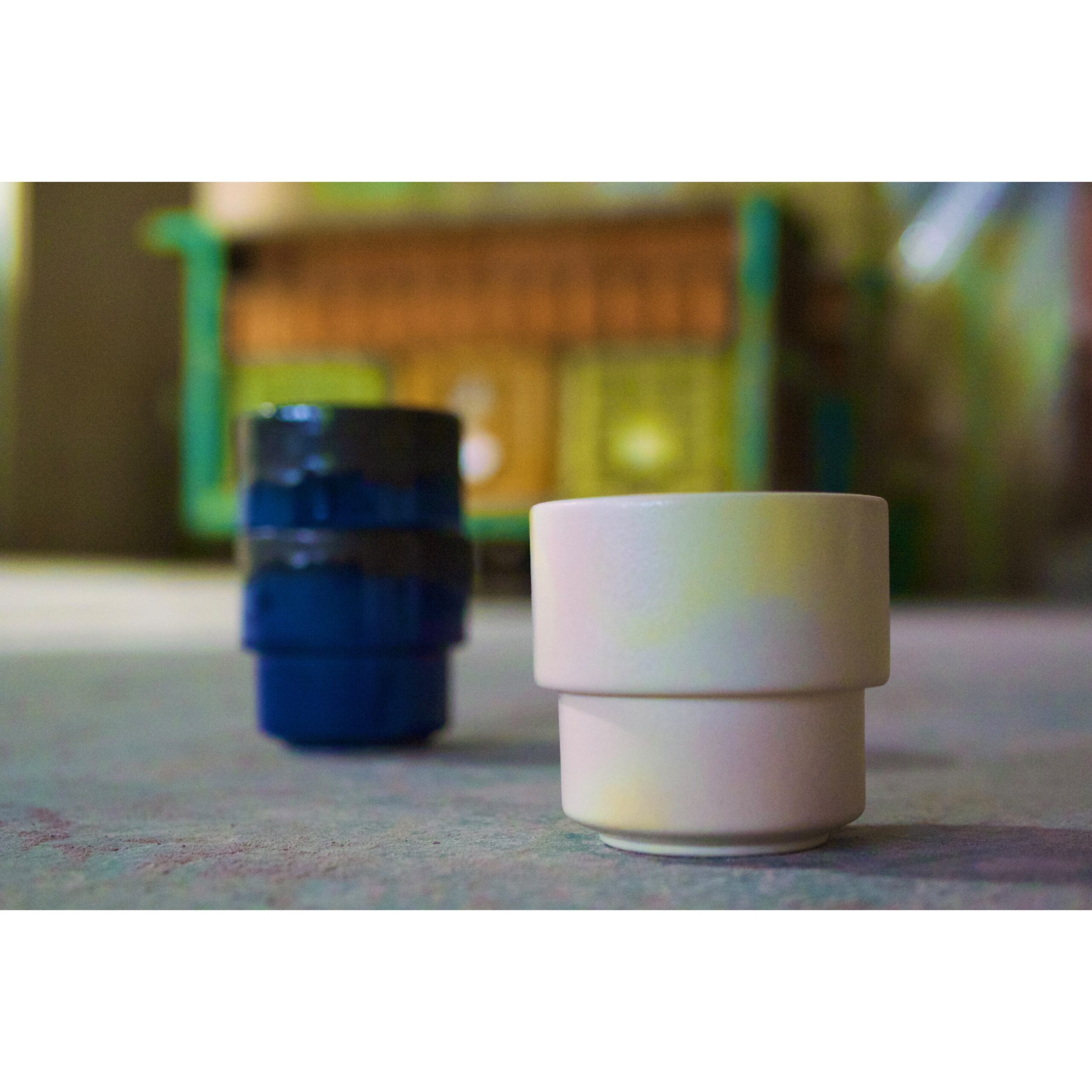
建築家ルイス・サリヴァンが述べた格言「形態は機能に従う。“Form follows function.”」 を思い出してみましょう。 「スタッキングできるカップ」という機能を求めて生まれた“towa”は装飾を最小限に抑えた、クリーンで明快なフォルムとなりました。デザインにおける「モダン」とは、無駄を省いたシンプリシティの意味合いのことが思い起こされますが、この言葉に含まれる意味はもう少し多義的です。産業革命以来発達し続けた新しい製造技術による「効率性」と「同時代性」も見逃せない要素です。紅輪のプロダクトもその多くが、施釉以前の成形の段階で機械を使用しています。これが人間的な感覚が必要とされる両手・五指での施釉と重なったとき、紅輪のコンセプトである“Answer The Contrast”が響き始めます。デザインにおけるモダニズムに大きな影響を与えた活動の一つが、20世紀初頭にドイツで設立された芸術とデザインの学校「バウハウス」です。バウハウスはアルファベットの小文字化を提案しました。もともと書体の出自が異なる大文字と小文字とを併用するのではなく、小文字表記だけでの可読性を高め、かつ作業の合理化をも目指しました。ナショナルなものを超えた「国際」という精神が息づいていたのです。 紅輪のロゴを“kōrin”と小文字にしているのは、バウハウスの「小文字」という慎ましいものから壮大無比な思想へと昇華させる精神に敬意を払ってのことです。紅輪の“towa”は、刻々と息づくモダニティの嫡子であり、永遠に忘れてはならないインターナショナリティの証であり続けます。
Let’s recall the maxim by architect Louis Sullivan: “Form follows function.” “towa ” born out of the pursuit of a functional “stackable cup,” embodies a clean and clear form with minimal decoration. While the term “modern” in design often brings to mind simplicity and efficiency by eliminating excess, its meaning is more nuanced. Many of kōrin’s products utilize machinery in the shaping process before glazing, while the glazing itself is done by hand, using both hands and five fingers. One of the influential movements shaping modernism in design was the Bauhaus, an art and design school founded in Germany in the early 20th century. The Bauhaus advocated for the use of lowercase letters in typography, aiming to enhance readability and streamline operations by exclusively using lowercase characters.It embraced an international spirit transcending national boundaries.The Bauhaus elevated the concept of “lowercase” to a grand spirit. kōrin’s use of lowercase in its logo pays homage to the spirit of the Bauhaus.”towa” by kōrin is the legitimate heir of ever-evolving modernity, a testament to the enduring spirit of internationalism that must never be forgotten.
Size | Φ7.5cm × H7cm | 150ml
⚪︎Microwave ×Oven ⚪︎Dishwasher


